Pages
▼
Saturday, September 30, 2006
Children's Books Display - Part 23
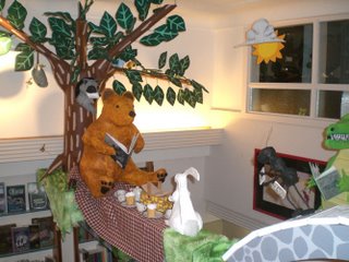
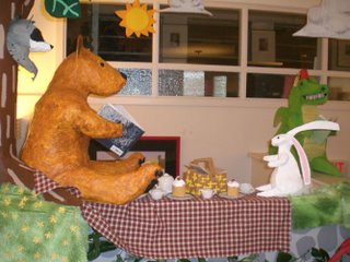
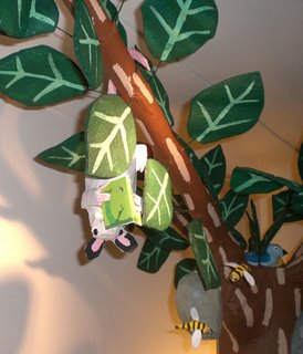
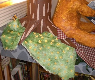
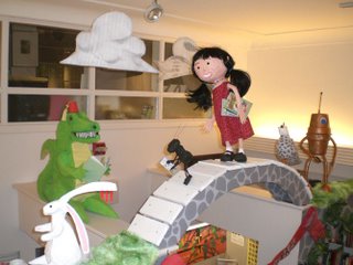
Here's the display with the monster, finally, added. At the beginning of November I will post final images of the complete display with the monkey, and perhaps the boy from the window, incorporated into it.
Children's Books Display - Part 22
Nearly as important as the permanent interior display, was putting one together for the store's window. The window display needed to get people into the store. It also needed to not only announce that changes had been made to the children's section, but needed to physically reflect those changes as well.
Even at the beginning of construction on the main display, I thought about the window display. I sketched out rough ideas in order to decide what I'd need to populate the space. As mentioned earlier, I didn't want to build a bunch of additional characters who only had a one month use, so I tried to use characters meant to go into the permanent display, but whose initial absence there wouldn't impact the effect of the permanent store display.
Eventually I decided that four characters would be plenty, accompanied by some interesting effects and carefully selected books.
/>
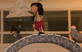
Here's a forward view through one of the windows, featuring the monkey. The monkey is the only character I created with the double duty of being in both displays in mind. Here it hangs by its tail. In the display it will be seated on a stump.
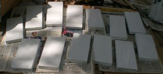
The boy and monster were made exclusively for the display. Details about each can be read in earlier posts. The word balloons are simple paper constructions hung by fishing line. The "floating" books are fake, assembled in much the same manner as the prop books constructed for the main store display. They are essentially rectangles of cardboard covered with white paper, which color photocopies of selected book covers glued to either side. They are suspended from the ceiling by fishing line so that they slowly spin alternating covers.
The books I selected were all carefully selected by me, and for the most part were all classics. I was also sure to only use books that the store carried, though the cover art might differ. I was tempted to choose only out of print books that were favorites of mine as a child, but thought customer queries could be frustrating for both the customers and the staff. Besides, as a signal of upgrades to the children's section, I thought it would be better to actually make people excited about books they could take home right away.
The fish is something I made about a year and a half ago for a friend of mine. He was generous enough to lend it back to me for the duration of the window display, saving me from creating something else that would use that vast expanse of empty wall.
This was fortuitous. About six months ago I found a large amount of cloth in a thrift store, that I couldn't pass up. The cloth featured large images from a number of fairy tales such as "Little Red Riding Hood," "Rapunzel" and others. I had no idea what I was going to do with it, but loved the design of the images. I still have no idea what I'm going to do with it, but in the meantime, it made the perfect backdrop for this adjacent window. Against the cloth I placed three selections of myths and folktales aimed at children.
Like the hanging books, the real books chosen for the window display were carefully selected by me. I tried to pick a good cross selection, leaning more towards outstanding illustration, as well as old chestnuts. This picture was taken just a couple hours ago, and as you can see there are gaps. This is a regular occurrence, meaning that I chose pretty well. The green box housed an open copy of the fantastic new Maurice Sendak pop-up book, "Mommy" (more about this book in an upcoming post). The store's sold every copy already.
One of the pleasant surprises has been the reaction to the window by an audience I hadn't considered so much when putting it together. The goal was to get parents and kids into the store, and kids to want to return. Pleasantly surprising is seeing older customers, leaving the store with their copies of Noam Chomsky, stopping outside and stating "I remember that book," as their faces light up with pleasure.
Children's Books Display - Part 21
Here are a bunch of detail shots of the display, which I'm posting without any narrative. If you have any questions, feel free to ask.
I know some people were having difficulty posting comments in the past, and I appreciate the emails. I'm guessing the problem had to do with blogger's server, as there were a few days that I couldn't load pictures either. Hopefully the problem is now solved.
The final posts should be up late tonight, and will detail the accompanying window display, and updated shots of the main display with the multi-eyed monster added.
Beginning tomorrow, 31 days of Halloween tricks and treats.
Children's Books Display - Part 20
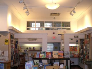
Again, here's the children's section of the store as it originally appeared before this project began.
As I did with the bridge components, I painted the the archways over the two alcoves the same base coat of light grey, followed by darker grey stone patterns. That white square in the middle is the wooden base screwed onto the bottom of the tree which is lying on its side.
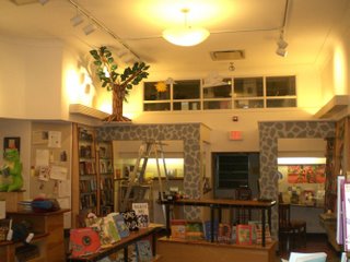
Here, the tree, sun and clouds have been added. The sun was simply two pieces of cardboard glued together, paper mached and then painted. The clouds were painted on cut out pieces of cardboard, which were then covered in thinner versions of the same white foam sheets of packing material that the leaves were made from. This material was sheer enough that the paint patterns showed through, and gave a nice sheen and texture to the clouds as well.
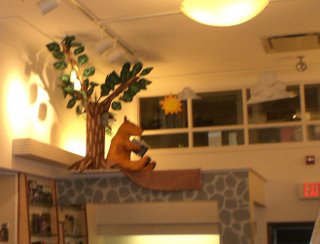
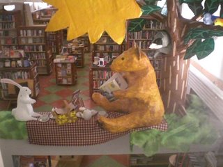
Now the bear and picnic blanket have been added.
>
The bridge was assembled on the floor, with the three characters screwed onto their respective slats from below. The entire thing was lifted into place via the ladder.
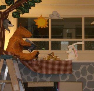
The rabbit is now in place.
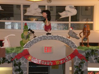
Skipping ahead, green material that ended up being perfect for grass was added around the base of the tree. Next, the flowers, which were all cut by hand from yellow paper, were glued to the grass. The picnic basket, settings, and cupcakes were then put in place. The crocodile was added, and so was the robot. Finally, here, the banner was put in place.
Close-ups of various aspects of the display will be in the next post.
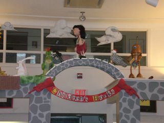
>
Here you can see the wood slats that were screwed onto dowels inside his feet. These slats were then screwed into place on the top of the archway.
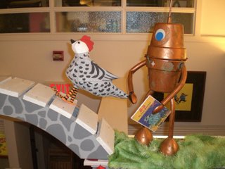
>
Grass was added around the robot, not only to balance the display, but to camouflage the wood blocks. The empty space behind the robot is meant for the monster with the multitude of eyes. Unfortunately, it broke during installation. Repaired and brought back later, it broke again. Major reconstruction has been done to avoid the problem, and it should be in place by the time I put up the final post in this series, and a look at the display with the monster in place will be included.
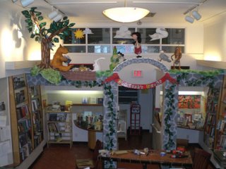
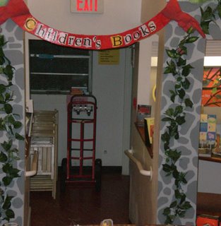
Once everything was in place up above, store bought ivy was added to both sides, seemingly climbing the walls, and leading the eye up to the display. Butterflies (also store bought) were also added in various locations, mainly to add some color, and suggested movement.
Except for the monster, and the monkey (which will first appear in the window display) the installation is complete, though there is a possibility that card stock silhouettes, and theater light gel shapes may be added to some of the lighting to give the illusion of more depth to the display, but that is further down the line.
The following two posts will show the display in details, and the window display, completing this series.
Children's Books Display - Part 19
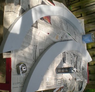
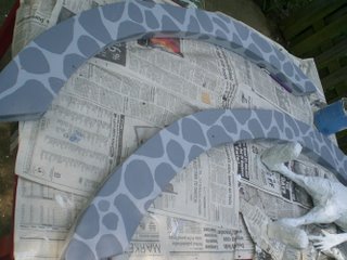
The final two elements that needed to be made were the banner, and the bridge itself. The sides of the bridge were cut from two four foot lengths of 2x8 pine board. These were primed and then painted a light grey color.
The slats for the bridge were seven inch lengths of a 1x4, which were painted white. I wasn't concerned about exact evenness of lengths, or beautiful uniform painting. I liked the idea of it looking somewhat crude and homemade.
Once the initial coat of grey was dry, the suggestion of stones was painted along the sides using a darker grey. The results sort of look like black and white giraffes. I wasn't going for realism, and knew that in the final installation, it would look like what it was supposed to be.
The bridge would later be assembled on site.
For the banner, I traced one of the bridge sides on a large piece of cardboard, so that the arc of the banner would match the arc of the bridge above it. Gloves with pointing index fingers were fashioned out of cereal box and newspaper, and attached to the cardboard banner with masking tape. The entire thing was then covered in paper mache, a somewhat difficult task since the entirety of the banner was longer than any table I had to work on.
Once dry, the banner was primed and then painted a bright red. I printed out the words "Children's Books" in a large font size on a few different colored sheets of paper (I ended up only using white, yellow, and off white), which I ripped into the individual letters, then decoupaged onto the banner using white glue followed by a coat of clear gloss. I thought this would look better than any hand painted lettering I could manage on a somewhat uneven surface, and would also be easier to read from a distance.
Thursday, September 28, 2006
Children's Books Display - Part 18
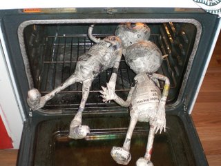
The two children I ended up nicknaming "Hansel and Gretel" for obvious reasons. Humid conditions required that I dry them in the oven.
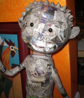
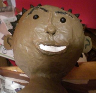
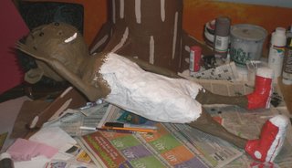
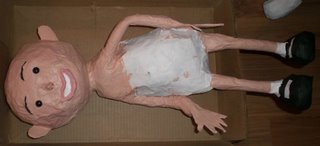
The boy was constructed in essentially the same way as the girl. His features were all made using the same cereal box ears, and paper pulp/wheat paste mix for eyebrows, nose and mouth. The boy's hair was also made from this mix, as I essentially covered the entire hair area with small pyramids made from this mix.
Here, I've tested out the eye placement before painting. It's amazing how a couple of shiny black plastic beads, essentially, can bring even the most unfinished construction to life.
Next, he was primed...
...and painted. All of the painting was done with acrylic paints.
As with the girl, I didn't bother painting any areas I knew would be covered with clothing. The sneakers (still wet here) and socks were also painted on.
I spent a lot of time painting the boy's Chuck Taylor's, only to find out that once he was dressed, you really couldn't see them. This was fine with me in the end, as I'd already spent a good amount of time, laboriously threading a shoelace through one of them. I didn't bother with the other one.
The boy stands about a full head taller than the girl. This was done because he was always meant to be part of the window display, and so needed to be large enough to be visible for some distance, and able to attract attention. If I can manage it, I'll probably incorporate him into the main display at the end of his time in the window.
Children's Books Display - Part 17
At this point there were only two characters left to make; the boy and the girl. The girl came first as she was an essential element of the permanent installation, while the boy was, literally, window dressing.
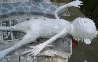
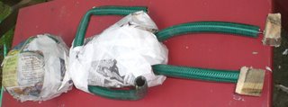
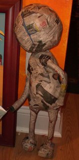
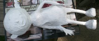
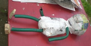
Like many of the prior characters her body was essentially a loaf shape of stuffed newspaper with garden hose and coathanger wire limbs. Her feet were blocks of wood. Her head was a big ball of wadded up newspaper.
She was initially paper mached without her hands, which were done seperately and paper mached to her wrists later. The hands themselves were simple carborad cutouts since no articulation was required.
Her facial features were added next. Her ears were cut from a cereal box. I used the same paper pulp/wheat paste mix as in prior characters to sculpt on her eyebrows, nose, lips and dimples...
...which are easy to see in this photo of her with her primary paint application.
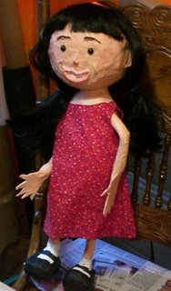
Next, her skin was painted. I didn't bother with her torso since I knew it would be covered by clothing. The socks and mary jane shos were also painted, as were her teeth, lips, cheeks and eyebrows.
The eyes themselves are plastic stuffed animal eyes. The eyes were an initial concern. I was not attempting to make realistic looking children. When I've depicted children in my two dimensional collage art, they've all tended to have large eyes. I knew that merely painting the eyes onto the face would look flat and lifeless. I toyed with using ping pong balls, like I did in the cyclops and a few random paper mache creations I'd done in the past, but feared that on the children it would look freakish. As I'd already gone past my self imposed deadline due to uncooperative weather (it was necessary to construct everything outdoors), I didn't have time to experiment. I ended up deciding to go in the other direction, giving them small beady eyes, which ended up working pretty well I think.
A dress sewn by my wife specifically for this piece was added, followed by hair. This hair was actually a dress up wig which had started appearing in inexpensive abundance with Halloween right around the corner.
/>
Books were added next and she was then installed. Originally, she was supposed to be posed in mid stride, with one foot elevated. I had some concern about all of her weight being held up by one foot screwed to the bridge, as her balance wasn't as evenly distributed as I had hoped, so at the last minute I decided to also screw her second foot to the bridge, which gives her a bit of a lean to her right. This is okay, as I figure she's compensating for the weight of the three books she's carrying, and simply walking with a bobbing weave like a kid listening to interior music.
Children's Books Display - Part 16
The installation itself also contained a monster character. This character was based on a sketch for a character I created for one of the areas of planned upgrades to my main website. When it was time to add it to the main website, it went through a couple of mishaps ( see Children's Books Display - Part 1 ) which will be discussed in further detail when I get to the posts on the installation process itself.
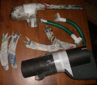
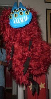
As can be seen here, the monster was made of very simple materials. Here the head (all newspaper) and arms (cardboard) have already gone through the paper mache process. The body was a simple mailing tube with foam taped around it to give the monster a bit of a hunchback. The legs are garden hose inserted with coat hanger wire and wooden blocks for feet.
Here are the legs after being paper mached. As you can see, toes have been added to the feet. These were simply wedge shapes made from cardboard. Since it would be covered in fake fur, there was no need to paper mache the body itself and it was left in its raw form.
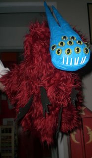
Here's the completed monster. The eyes are the same plastic cat's eyes that I used on the crocodile. The teeth are the tines of plastic forks. The head was screwed onto the tube before the fur was added, as were the legs. Once the fur was added, slits were cut in it where the arms needed to go. These were also screwed onto the cardboard tube.