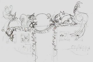
I began toying with the idea of creating some sort of 3D installation piece to connect the two alcoves, and get kids to not only want to linger in the alcoves beneath it, but to want to keep coming back to the store, even if only on the pretense of seeing the display.


The initial sketches were simply attempts at getting comfortable with the architecture, and simply playing with shapes and forms to unify them, such as the cloud/shrub form in the top sketch meant to somehow bridge the two arches/alcoves and bring them together. Several animal and creature ideas were played with and eventually discarded, such as a large bird and a dragon.
I initially liked the idea of a dragon that would look down at the kids from its perch, its face and tail tantalizingly just out of their reach. The reality though was that the width of the space atop the archway was only seven inches wide, which would have given the dragon grotesque proportions, or given me an engineering problem I wasn't willing to wrestle with, which would be on figuring out a way to have a much larger figure safely perched on such a narrow space. I opted to reduce the scale of the characters to something more suited to the narrow dimensions of the space.
I then decided on a literal bridge, and the rest fell into place pretty quickly. There was originally going to be a number of characters suspended from the air as well including birds, a rocket, a blimp, a fairy, and a man on a flying carpet. I realized that their spinning on the end of a piece of fishing line, or simple remaining in place in a fixed pose would detract from any illusion of life rather than contribute to it, so they two were dropped.

Once the final rough idea was presented and okayed, I set about measuring every detail of the space I would be working in, which was crucial, obviously. It was then that I learned that there was actually less room than there appeared to be. The maximum height for any object was four feet, and there were lights to consider as well. Once this was done, I was ready to start building the elements of the installation.


No comments:
Post a Comment